If you follow us on social media, or your kids attend one of our sessions, you will probably be aware by now that over the last few months we have undergone a period of rebranding. We’ve spoken a lot already about our reasons for this but today, we wanted to take a little bit of time to look at the inspiration behind our new look and unpack a little of what we are hoping to reflect through it.
 Stronger Together
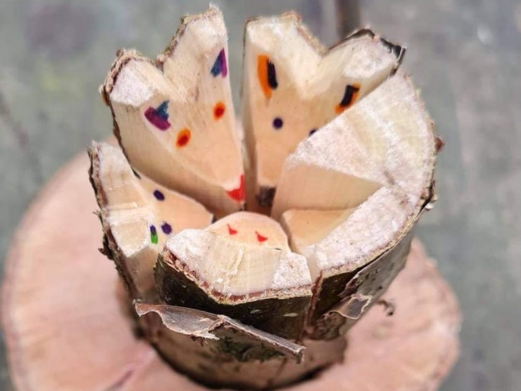
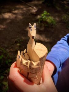
A little while ago a colleague shared amongst a staff group, a few pictures of the woodworking project that a learner at one of our Home Education groups had just completed. She had taken a log and split it equally six ways before carving the head of each section into a woodland animal head and then putting them back together. This simple but visually striking woodland craft resonated with many of us, and particularly with the directors. We loved the idea of this representing us as a company. We now have several strands of the business, each unique and different in their own way, but together we form one whole, one organisation with the same values and goals. This image became the inspiration for the idea of our business pillars as part of the rebrand, giving each of our business areas their own identity but bringing in parts of each pillar to the main logo to convey our commitment to community and togetherness.
If you know anything about Forest School, you’ll know that it originated in Scandinavia where children and young people were first taken outdoors as part of their learning. In fact, not just for part of their education…when it came to the original forest school kindergartens, toddlers spent all their days in the Scandinavian woodlands; playing, exploring and spending time with their peers in the great outdoors. We felt that it was incredibly important to pay tribute to these roots of Forest School and so made sure that ‘scandi’ patterns were incorporated into each part of our new branding, from our individual pillars to the main logo.
 Looking Further Back
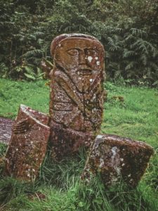
We also wanted to honour our own native roots and our ancestors who trod the land that we now inhabit, here in our little corner of Southwest England. Our directors were particularly inspired by the Celtic carved stones that appear all over Great Britain and Ireland from the Stone Age. Examples of these can be found not far from some of our sites on Dartmoor. We used these carvings as more inspiration for our pillars but replaced the faces at the top with a different native woodland animal for each business area, animals that we can find and do encounter regularly in our own forests. The main logo then represents the landscape that these animals inhabit complete with hills, trees, waterways and of course, the reliable rising sun.
Finally, we were keen to retain a sense of our core values within our new logo. We are just as committed to these as we were ten years ago and don’t ever want to get so bogged down in bureaucracy that we lose sight of what matters. Time spent outside, time spent adventuring, time spent with our community. We hope that you agree that our new image conveys this, and we thank each and every one of you that has supported us over the last ten years as the company has gone from strength to strength and grown into what it is today. A beautifully diverse, community-centric, group of people committed to getting folks of all ages outdoors, committed to protecting our natural spaces, and committed to looking out for each other and always doing what is right. Author: Hannah Durdin, Marketing Officer & Forest School Leader Date: Monday 25th October 2021
Copyright © Outdoors Group Ltd 2021. All Rights Reserved.
Registered Office: The Outdoors Group, Western Lodge, Crediton, Devon, EX17 3NH. Company number 10755829
Terms & Conditions / Website Terms / Privacy Policy / Sitemap / Built with ♥ by Solve